Add images
You can add screenshots and diagrams to the Consensys documentation.
Add your image to an assets or images folder within the documentation folder, and link to it in
your doc content using
Markdown, CommonJS require, or ES imports.
You can also use HTML to center the image.
For example:
- Markdown
- CommonJS require
- ES imports
- Rendered
<p align="center">

</p>
<p align="center">
<img
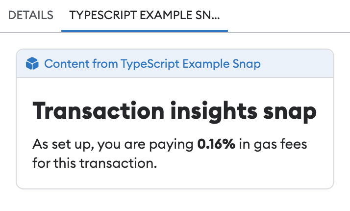
src={require("../assets/transaction-insights.png").default}
alt="Snap transaction insights UI"
/>
</p>
import txnInsights from "../assets/transaction-insights.png";

<p align="center">
  <img
    src={txnInsights}
    alt="Snap transaction insights UI"
  />
</p>
Screenshots
Follow the Archbee screenshot guidelines when adding screenshots to the Consensys docs.
You might need to re-size your screenshots to make them easy to view and to minimize the file size for faster page loading:
- Full-width screenshots should be 600-960px wide.
- Vertical, mobile-layout screenshots should be around 360px wide.
Diagrams
Consensys doc sites contain diagrams created using Mermaid and Figma.
Use diagrams to illustrate:
- Detailed or simplified product architecture.
- Technical processes and flows.
- Concept charts and tables.
Mermaid
To use Mermaid diagrams in your site, install the Mermaid theme plugin and use the Mermaid diagram syntax, for example, for flowcharts or sequence diagrams.
Figma
The following video demonstrates creating a Figma diagram for the GoQuorum documentation:
To create a Figma diagram, you must have access to the Developer docs diagrams template files on Figma, and use the following general guidelines. Refer to the Figma help website for more information on getting started with Figma, Figma design elements, and more.
Basics
- In the Quorum Diagrams file on Figma, each page contains diagrams for a different product.
- When creating a new diagram, create a new white frame in the product's page.
Add frames within the white frame for each iteration of the diagram.
- For each diagram, create a frame 756px wide using the Global Background color (#F6F6F6).
- You can resize a diagram's height, but keep the width at 756px. Anchor your elements to the frame using Left and Top constraints
- You can group and rename and organize elements.
- Hold down Command on Mac or Ctrl on Windows to select elements excluding the frame.
- Hold down Option and drag to duplicate an element.
Design
- Use the pre-made diagram assets as starting points. By default, you can adjust the width of the pre-made labels, but the height is automatically sized to the number of lines of text. To freely customize a component, right-click on it, detach instance, and remove auto layout.
- Use the pre-defined color styles or black (#00000).
- Use rounded corners of radius 2 for rectangular labels and containers.
- Evenly align elements.
- Represent similar conceptual elements using similar styles. For example, represent two nodes using a dark gradient, and represent two external components using a light gradient.
- You can reuse existing icons from any diagram on any page. For example, there are already icons to represent databases, dapps, keys, locks, and logos.
Hold down Shift when drawing, resizing, and rotating to create perfect horizontal and vertical lines.
Text
- Use font Roboto for all text.
- Use font sizes between 10–18.
- Use sentence case in labels and titles.
Arrows and lines
- Use a thickness of 2 for arrows, lines, borders, and other strokes.
- Use Triangle arrow heads.
- Use straight arrows and lines, with right-angle bends if needed. Don't use diagonal arrows and lines. If possible, don't overlap arrows and lines. To create additional bends in an arrow or line, detach instance (if applicable), double-click the arrow or line, and click and drag the anchor points.
- Leave about 3px of space between arrow heads and the elements they point to. Line ends without arrow heads should touch the connecting element.
See the Figma documentation on the Arrow Tool for more information.
Export your Figma diagram
- Select the frame of your diagram. Make sure all elements of your diagram are contained in the frame. The name of this frame will be the name of the exported image.
- Scroll to the bottom of the right sidebar. In the Export section, choose 2x scale (for retina screens) and PNG or SVG file format.
- Export the diagram to the image folder of the documentation site
(for example,
doc.goquorum/docs/assets).
See Figma's guide to exports for more information.